
Spacing on Styling


On my current job, I've been using a very well structures internal design system, and one of the thing I've really likes is the idea about how to use "Spacing" on design.
If you are a solo dev or need to deal with UI sometimes, you know how difficutl if to make the spacing looks "correct". But there is a approach that can make you like easier.
Instead of defining exact the amount of spacing (in pixel) you use just a "Scale Factor". You define a value, for example a range from 0 to 10 (always entire number + the 0.5) :
ScaleFactor = 0 | 0.5 | 1 | 2 | 3 | 4 | 5 | 6 | 7 | 8 | 9 | 10;And uses a function to return the correct amount of pixels for the spacing according to a predefined scale (for example, 8 pixels).
Example
Let's consider that my "Unit Scale" is 8 pixels. I will create a spaceUtils file that receives a scale factor and return the correct amount of spacing
type ScaleFactorType = 0 | 0.5 | 1 | 2 | 3 | 4 | 5 | 6 | 7 | 8 | 9 | 10;

const SCALE = 8;

/**
 * @param scale factor 0 | 0.5 | 1 | 2 | 3 | 4 | 5 | 6 | 7 | 8 | 9 | 10
 * @returns scaled spacing
 */
export const spacing = (space: ScaleFactorType) => {
  return space * SCALE;
};
On the styled component, I use all the spacings through my lib, passing just the scale factor as parameter:
import { spacing } from 'utils/spaceUtils';
...
export const ItemContainer = styled.TouchableOpacity`
padding: ${spacing(1)}px;
justify-content: center;
align-items: center;
padding-right: ${spacing(2)}px;
padding-left: ${spacing(2)}px;
background-color: yellow;
height: ${spacing(4)}px;
border-radius: ${spacing(0.5)}px;
`;
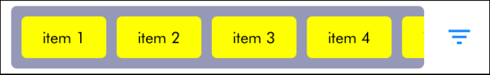
...And the result, is a well distributed UI without headaches
Give it a try and see how useful this simple tip is :-)